
Letters to the Editor
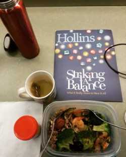
Thanks, Hollins, my alma mater, for a reminder that I need to find a balance in my grad school life. #womengoingplaces #myhollins
Lan Nguyen ’18, via Instagram
I just read as much as I could of the latest edition of Hollins magazine. I say “as much as I could” because the layout/design prevented me from reading the magazine in its entirety. Reason? Color choices and size of type. Most especially, I was unable to read the “In Memoriam” column on Larry Becker because the type was tiny, and black on a brown background. My level of frustration went off the charts. What were your designers thinking?
Just because a design choice is pretty, or edgy, or whatever, doesn’t make it functional.
I am a member of the class of 1974, which makes me in my (upper) mid-60s. For alumnae of my age, our eyes aren’t what they were even 10 or 15 years ago. Please keep us older alumnae in mind when you lay out the magazine.
Donna K. Hughes-Oldenburg ’74, M.A. ’75, via email
![]()
Editor’s response: We agree with you and have taken steps to improve readability by running the profiles and class letters in larger type and monitoring background colors.
We want to hear from you for the Letters to the Editor page.
Send your letter to:
Magazine Editor
Hollins University
Box 9657
Roanoke, VA 24020
Or